

The Proven Designer Tricks for Luxury Decor on a Budget
“Luxury doesn’t require money” is technically true and mostly useless as advice — it doesn’t tell you what to actually do. The real answer is more specific: a handful of concrete techniques account for almost all of the difference between a room that looks put-together and one that doesn’t, and none of them require a big budget.
Here’s what those techniques actually are, with the specifics most “luxury on a budget” advice leaves out.
Why Some Cheap Rooms Look Expensive, and Some Expensive Rooms Look Cheap
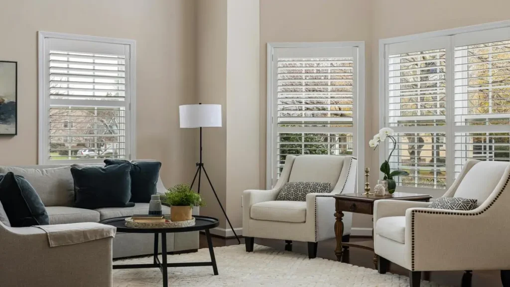
The difference isn’t the price tags on individual items — it’s coherence. A room full of expensive pieces that don’t relate to each other in color, scale, or style reads as cluttered. A room with budget pieces that share a consistent palette, a clear focal point, and varied texture reads as intentional. Intentional is what “luxury” actually means visually — it’s a design principle, not a price point.
Color: The 60-30-10 Rule
Interior designers use a specific ratio to keep a room’s palette from feeling either boring or chaotic: 60% dominant color (walls, large furniture), 30% secondary color (curtains, an accent chair, a large rug), and 10% accent color (pillows, art, small objects). This 60-30-10 rule is a long-standing principle in interior design, and HGTV is one of many design authorities that recommend it as a reliable starting point for beginners.
For a budget-friendly high-end look, keep the 60% in a neutral (white, greige, soft taupe) and use the 30% and 10% for depth — a darker tone of the same neutral family, plus one accent color used sparingly. Rooms that skip this ratio and treat every element as equally prominent are the ones that read as busy, regardless of how much was spent.
Lighting: Temperature and Layering Matter More Than Fixtures
The fixture matters less than two specific things: color temperature and number of light sources.
Color temperature: stick to 2700K–3000K bulbs (labeled “warm white” or “soft white”) throughout main living spaces. Anything above 4000K reads as clinical rather than inviting, regardless of how nice the fixture is.
Number of sources: a room lit by a single overhead fixture almost always looks flatter and less expensive than the same room with three light sources at different heights — a floor lamp, a table lamp, and either a ceiling fixture or wall sconces. This layering is what creates the shadow and depth that photographs and feels expensive; it costs the price of two lamps, not a renovation.
Texture Does the Work Color Alone Can’t
A monochrome room with zero texture variation looks flat, no matter how good the color choice is. Texture is the cheapest way to add depth: a nubby throw blanket, a velvet or bouclé cushion cover, a linen curtain, a jute or wool rug. Mixing at least three distinct textures in a room — even within the same color family — is what separates “beige and boring” from “beige and layered.”
The One-Focal-Point Rule
Every well-designed room has exactly one thing the eye goes to first — a piece of art, a striking mirror, a bold piece of furniture. Rooms that lack a focal point feel unfinished; rooms with three or four competing focal points feel chaotic. Pick one per room, and let everything else support it rather than compete with it.
Mirrors: Where They Actually Work
Mirrors do two specific things well: they bounce natural light, and they add apparent depth. For the light-bouncing effect, position a mirror directly across from — not adjacent to — your main window. For depth, an oversized mirror leaning against a wall (rather than hung) reads as more current and less formal than a small mirror centered above furniture.
The Small Swaps With the Biggest Return
Ranked roughly by impact-per-dollar:
- Cabinet and drawer hardware — swapping builder-grade knobs for a matched set in brass, matte black, or brushed nickel changes the perceived age of kitchen and bathroom cabinets more than almost any other single change.
- Throw pillow covers (not whole pillows) — a $15–20 cover in the right texture does most of what a $60 new pillow does.
- A single large piece of art over several small ones — one 24″x36″ piece reads as more intentional than a cluster of small prints, even at a similar total cost.
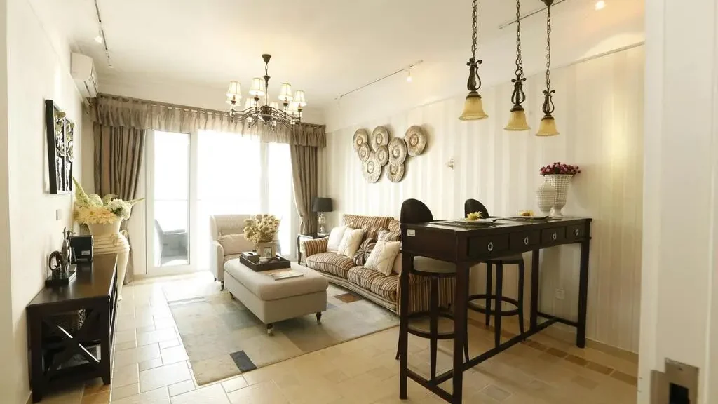
- Curtain length — curtains that just graze the floor (or puddle slightly) read as significantly more expensive than curtains that stop short above the sill, which is one of the most common budget-decor mistakes.
Where to Actually Spend Money
Not every category benefits equally from budget alternatives. Two are worth prioritizing real spending on:
Anything you touch daily — a sofa or mattress you use constantly shows wear fastest, and low-quality versions both look and feel cheap within a year, undoing any styling work around them. Protecting that investment ties into the same upkeep habits covered in our home maintenance schedule.
Large-format items — a rug or sofa in a cheap-looking material is highly visible precisely because of its size; smaller items can get away with budget materials far more easily since they occupy less visual space. Keeping the rest of the room decluttered — see our smart storage ideas for small spaces — also protects the investment you do make, since clutter undercuts even well-chosen furniture.
Styling Like a Professional
Two specific techniques, beyond general “keep it tidy” advice:
Rule of three. Grouped objects in odd numbers (especially three) read as more intentional than pairs or single items scattered around — this is a real principle from visual design, not just a preference.
Height variation within a grouping. A shelf or table styled with objects all the same height looks like storage; varying height (tall candle, medium book stack, short object) is what makes the same items look styled.
Frequently Asked Questions
What’s the single highest-impact change on a tight budget?
Lighting temperature and layering — it costs the price of a couple of warm-toned bulbs and lamps, and it affects how the entire room feels, not just one area.
Is it better to buy several cheap decor pieces or save for one nicer one?
For large-format items (rugs, sofas, curtains), prioritize the nicer one — cheap materials are most visible at scale. For small accent items, quantity and coordination matter more than individual quality.
Do accent walls still work, or are they dated?
They work when limited to one wall in a room and kept within the same color family established by the 60-30-10 rule — the mistake is an accent wall in a color that has no relationship to the rest of the palette.
How many focal points should one room have?
One. Rooms with multiple competing focal points read as cluttered, regardless of how nice each individual piece is.
Key Takeaways
- Coherence, not cost, is what makes a room read as high-end — consistent palette, one focal point, varied texture.
- Use the 60-30-10 color ratio to avoid both boring and chaotic palettes.
- Warm-toned bulbs (2700K–3000K) and three light sources per room outperform any single fixture upgrade.
- Mix at least three textures to avoid a flat, one-note look.
- Hardware, pillow covers, one large art piece, and floor-length curtains are the highest-return budget swaps.
- Spend real money on daily-use items and large-format pieces; save on everything else.